How did the creative process work for the two of you in putting the book together? Was there a lot of back-and-forth, or did you do your parts independently?
SW: My strip was pretty detailed, but Alex was always keen to suggest new pages, mostly in sequences set in the Zone. Thanks to him, we spend more time exploring that world, which gives the book a more dreamlike quality. He has a wonderful sense of pacing, expanding events in a sort of “bullet time” way. All the climaxes of the book were heightened by him stretching them out way beyond my script, into long, wordless, and trippy passages.
AP: There was a good deal of back and forth, especially toward the end of book one which was in flux for a while.
Scott was great to work with and very open to suggestions when it came to staging or pacing or even specific story points. All scripts need a little of bit of adapting to be properly visually translated to the page and he gave me all the space I needed for that.
In exchange I tried to show him the pages as early as possible to be sure he was happy with the direction I was taking.
I sent him the whole book thumbnailed, one chapter at a time (roughly 70 pages). I think that gave him the chance to make changes at a stage where everything is still very fluid. Thumbnails drawings are so simple you can throw them away and redo them in no time if you have a better idea. You’re not precious with the work and you can quickly see what works and what doesn’t. You can experiment, add or cut dialog lines, try anything. It’s a very creative time. Once everybody was happy with the rough version of the book, I took the pages to finish and inked them. There were a few last changes on the final inks but very few.
I personally enjoy collaborating closely with writers. I think it makes for better books.
 Did you always envision this story as a graphic novel?
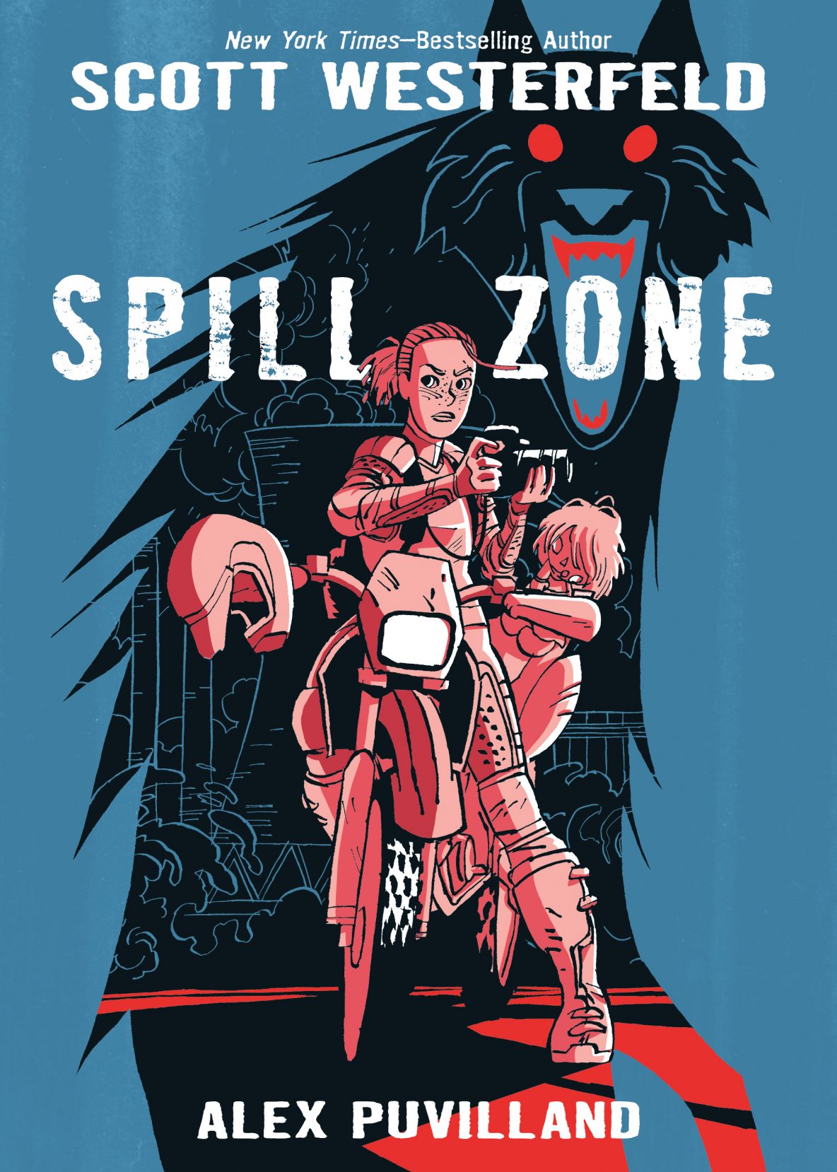
SW: Yes. The Zone itself was always something that had to be shown in all its lurid glory. Addison is dealing with the loss of her home and family through photography, so I wanted her work as a visual artist to be on the page.
There definitely seems to be a dystopian flair to this story–how do you see it as different from the existing field of dystopian sci-fi?
SW: The Spill event was the size of a single town, rather than a global or country-wide collapse. That scale of disaster resonates a lot more with real-life places like Poughkeepsie, rust-belt towns that decay at a local level, rather than as part of some vast civilization-ending event. Most dystopias are local and personal, after all.
AP: Well Scott has a lot of experience writing dystopian stories so that would make sense. Personally I’m not sure I would call Spill Zone dystopian as the story is happening on a fairly limited scale. The Zone is only impacting a small part of the country. The rest of the population seems to be living completely unaffected lives. That’s what I liked about the script, the fantastical fits in a believable way in a larger part of everyday mundane reality. The book suggests the global cultural impact the event of the Spill had on the rest of the world but the story really focuses on very few characters.
 The color palette in the book is definitely unusual — with the psychadelic zone contrasting with the rest of the world. Why did you decide to portray it that way? Whose idea was it?
SW: In my original script, I wanted the “normal” world to be rendered in black and white, and the Spill Zone to be in color, like the 1939 Wizard of Oz film. But the First Second team and colorist Hilary Sycamore convinced me that the Zone should be rendered in hyperreal colors instead. I love the way the palettes shift from spread to spread, so your eyes have to adjust every time you turn the page, like walking into sunlight from shade, or like living under an alien sun.
AP: I must have come on board after that decision was taken then because I only remember the Zone planned as an oversaturated MGM technicolor world which would contrast with a duller, more muted real world.
I thought that was a great direction and experimented with color on a few image tests to try to find out how specifically that would work. I finally arrived to some kind of proof of concept we all liked. Our amazing colorist Hilary Sycamore took theses preliminary images and ran with the idea. We tried to make the Zone as unnatural as possible, from the absence of shadows and shading of any kind on objects to the weird changing sky colors Hilary used everywhere. The technicolor palette was very important because it’s the main tool we used to visually separate the Zone from the real world. Although it’s designed in a certain way, most of the actual Zone setting is fairly ’normal’ without the overall color treatment. We tried to limit the openly fantastical elements to a minimum and instead aimed for a skewed reality where the weirdness is more subtle, almost hiding.
 If you don’t mind telling us, what’s next for you?
SW: I’m returning to the world of Uglies, my dystopian series that finished back in 2007, with a book called Impostors. It picks up ten years after Tally’s revolution has disrupted that society, and takes a look at the consequences of the whole world having to rebuild itself. There’s less about plastic surgery, but more about identity and how we create ourselves when the world is crumbling around us.
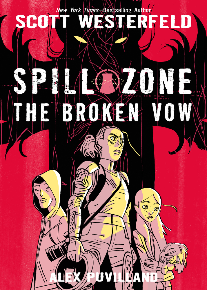
We’ve just wrapped up Spill Zone 2: The Broken Vow, which finishes off Addison’s story and ties up all the threads from book 1. It also features some of Alex’s most amazing and detailed art, especially in the huge climax! (Out July 10!)
AP:I don’t know yet! I’m trying to decide what my next project is going to be. . . .
Thanks to both of you!
You can find Scott at his website and on social media on Twitter, Instagram, and Facebook. You can find Alex at his website and on Facebook.